Comparing time periods
Many important analysis questions involve the comparison of data from two or multiple time periods. An example is finding root causes of process anomalies, by comparing anomalous periods to 'normal' periods. Another example is analyzing the effects of process changes, by comparing the period before the change to the period after the change.
Visplore supports defining the periods for comparison interactively and visualizes the compared data subsets in various ways (statistics, histograms, scatter plots and much more). Moreover, built-in analytics support searching for variables where the compared periods differ a lot - speeding up root-cause analysis for large numbers of sensors significantly.
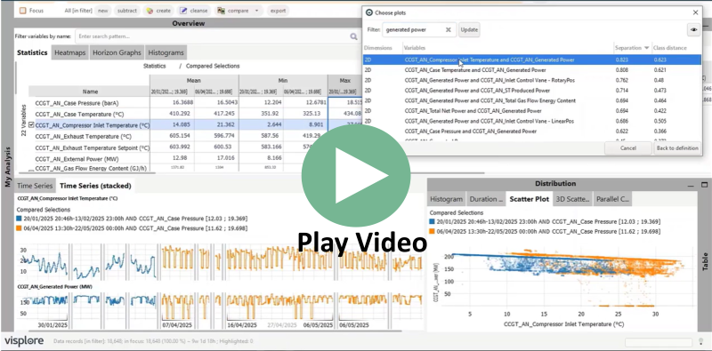
In this tutorial, you learn how to compare explicitly selected time periods.
Note: This section describes how you can select two or more intervals on a time axis to compare. If you want to compare all events where a variable has a certain condition like 'Temperature > 40', please refer to the chapter on 'Comparing events'. And if you have explicit assets or categories in the data (like 'process step 1' and 'process step 2') to compare, see the chapter on 'Comparing categories'.
Selecting time periods for comparison
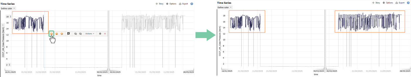
In this example we use data from a combined cycle gas turbine to analyze if a maintenance event has improved the turbine's efficiency. The goal is to validate and quantify the effect of the mainenance intervetion.
Select the steady operation period before the maintenance, by drawing a rectangle with the left mouse button. To select the second period after the maintenance, click on the '+'-symbol, as shown below, then again select the period as you did before.
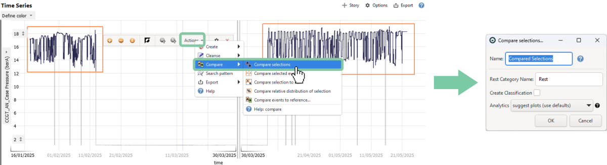
To compare these selections, click on 'Actions', then 'Compare', and finally 'Compare selections'. You can give the comparison a name, but this is optional.
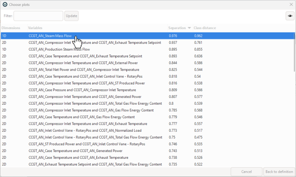
As a result, a built-in AI tool suggests plots showing what has changed. Furthermore, the views are re-configured to facilitate the comparison, e.g., by discriminating the selected segments using color or by subdividing axes. Everything but the compared data is temporarily filtered, and not shown:
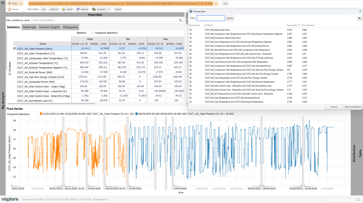
The following sections describe how the visualizations support comparing the selected periods in different aspects.
Interpretation of the plots
Click on the first suggested plot, which compares the distribution of the Steam Mass Flow in the two periods.
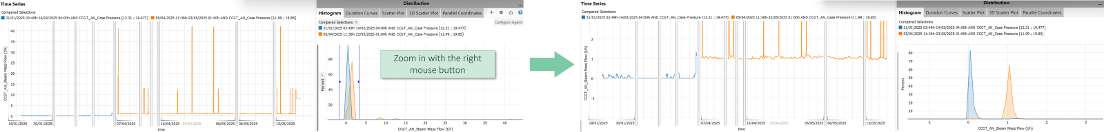
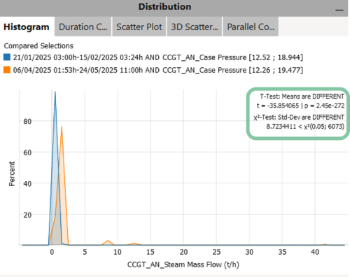
The 1D plots automatically open the Histogram view, which allows you to compare the value distributions across different time periods. At first glance, both distributions appear to center around zero. However, if you zoom in on the Histogram view using the right mouse button, you'll notice that the steam flow has increased significantly after the maintenance—something that might be overlooked in standard dashboards due to the influence of outliers.
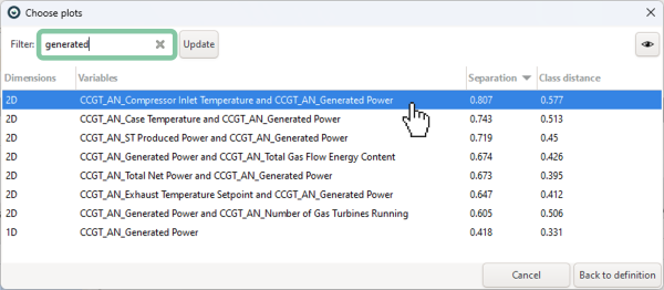
Filter the suggested plots to show only the results where generated power played a role, and select the top-ranking plot.
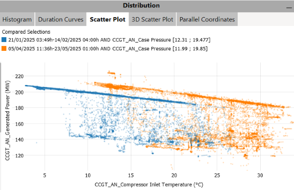
The 2D plots automatically open the Scatter Plot view, which helps visualize how relationships between variables have changed. In this case, you can see that the generated power was higher after the maintenance period for the same level of inlet temperature.
Note: You can also quantify the difference by adding regression lines in the Scatter Plot view. To see how this is done, refer to the video at the beginning of this page.
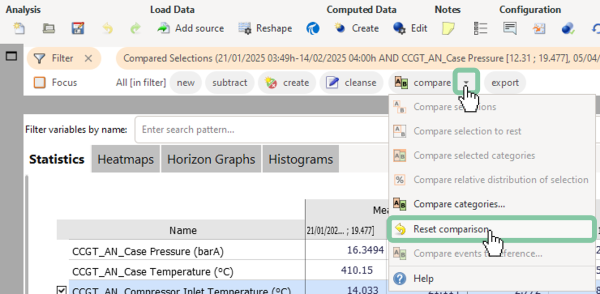
Reset the comparison
To reset the comparison, use one of two possibilities:
Remove the filter by clicking on the X, and then choosing to reset the comparison as well, when asked in the dialog.

Or: Click on the arrow next to 'compare', then 'Reset comparison'.
Useful tips for working with comparisons
- You are not limited to comparing only two periods, it can be any number of selections. The workflow is the same as described above, just select more than 2 time periods with the '+' icon inbetween.
- You are not limited to comparing time periods. Selections can be performed in many other views as well (e.g. select clusters in the scatter plot).
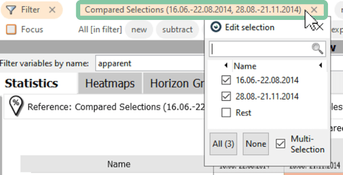
- If you are comparing multiple selections, you can display or remove individual categories in the filter bar (see image below).
- The histogram also provides a 'T-Test' and 'Χ2-Test' as highlighted in the image below. They are available when there are exactly two periods and can be enabled in 'Options' then 'Statistical tests'. These tests evaluate if the mean values of these two periods and the standard deviations are significantly different from each other. To better understand the functionality of the tests, please refer to the following sources: T-Test, Χ2-Test.
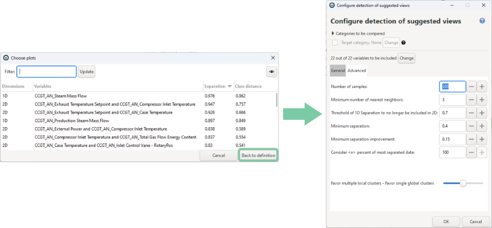
- If the default settings don’t yield the desired results, you can reconfigure the parameters used for detecting suggested plots. Please refer to the documentation page for the configuration dialog to better understand the available parameters.
Great! You have mastered the workflow for comparing time periods!